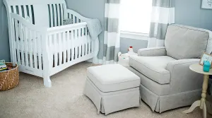
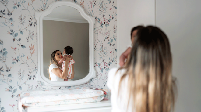
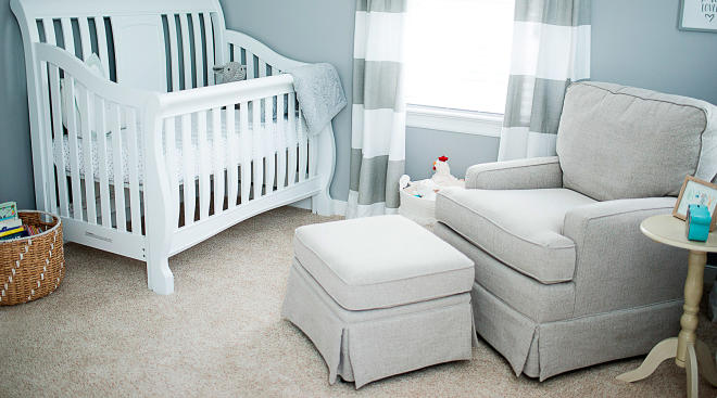
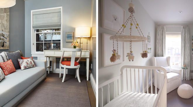
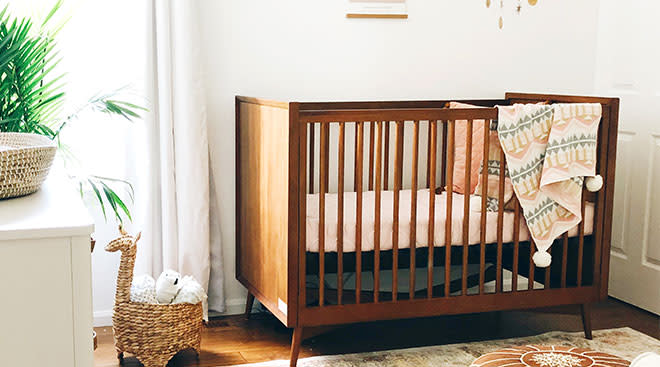
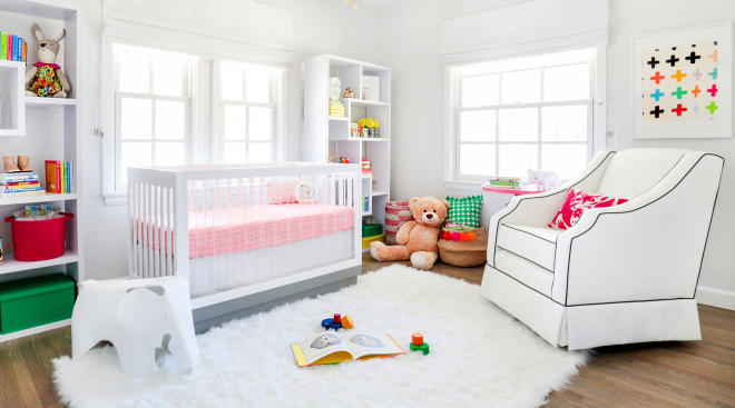
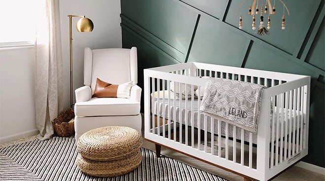
Blogger Chriselle Lim has been sharing her pregnancy journey on her blog, The Chriselle Factor, these last few months. Now that she’s just weeks away from giving birth to a daughter whom she’s already named Chloe, she and her interior designer Lucinda Pace of Laurel & Wolf gave The Bump an exclusive tour of the one thing Chriselle has been keeping under wraps: the nursery. The space, which once served as a guest room in Lim’s Los Angeles-area home, has been turned into the coziest of nurseries that could easily welcome a boy or girl. And looking at every detail inside the serene, woodland-themed space makes us very jealous that Chloe is one very lucky — and beloved — baby girl.
Tell us about how you came up with the vision for Chloe’s nursery?
Lucinda : Chriselle’s classic style and love for a neutral palette were the basis for the design. We knew we wanted to keep colors minimal and the overall feel of the nursery to be soft and sophisticated.
It’s both sophisticated and sweet but not typically “girly.” Was it a deliberate decision to not do pink or use a gender-specific color?
Chriselle: Yes! I’m glad you noticed that. That is a reflection of my own personal style and aesthetic: I don’t like things that are overly girly or vice versa. When I get dressed in the morning and I’m wearing a feminine dress, I’ll usually tone it down with a pair of edgy booties or modern sneakers. I like to describe my style as elegant, sophisticated and classic, and I wanted the nursery design to reflect that as well. Besides, I don’t think my husband would appreciate it if the nursery was decked out in pink head to toe! Everything is gender neutral, which is also practical. Let’s say if I have a boy next then I don’t have to buy anything new!
What was the timeline to getting it all done?
L : Before Chloe got here! But seriously after submitting the style boards things were underway pretty quickly; maybe a few weeks.
Were there any unexpected challenges?
C : We realized that we didn’t order enough wallpaper. It would’ve only covered three walls, but it all worked out as I LOVE how the one accent wall looks like.
What was the mood you wanted to capture in the room? And what was the room used for before it became the nursery?
C : I’ve always envisioned the nursery to feel pure and cozy. Before the nursery, the room was used as our guest room. The house I live in is actually the same house my husband grew up in, so it’s quite sentimental as the room is also the same room he grew up in as a child.
L : The guest room needed to transform into a serene and calming space, the kind of room you know to whisper in when you walk into it. We wanted everything to be cozy yet chic, and incorporating different textures and shades of cream and French gray made that happen.
What were your must-haves for the room?
C : The Serena & Lily crib — I’ve heard so many amazing things about it! Also the swivel & glider chair from Serena & Lily, as I know I’ll be spending a lot of time in the room breastfeeding; it’s important that I had a comfortable place in the room.
What was the most fun part of designing the nursery together?
C : It was great having a second opinion on things. Sometimes I second guess myself when it comes to interior design, so it was nice having a professional understand and execute my vision. It was very rewarding seeing it all come together in the end!
L : Chriselle and I speak the same language when it comes to design and style. We had a great repertoire to begin with so we decided to continue that into the rest of the house — coming soon! It was my first nursery design, so for me it was great to research and see what’s out there. Working within a more refined palette gave me the opportunity to get creative, which yielded a unique look.
Tell us about some of the special pieces in the room.
C : I absolutely love the little chandelier in the room, it really brings the room together — it’s the perfect amount of femininity! Also the “C” on the wall above the crib (probably will have to change the location once the baby arrives due to safety) is a piece of decor from my baby shower that my girlfriends threw for me.
L : We turned to Serena & Lily for the nursery furniture, and the inlaid dresser is also a Serena & Lily piece from their home collection. I think it gives a nice contrast to the nursery items and it’s a piece that Chloe can use over the years as she grows. I think the chandelier gives the room a bit of whimsy; it’s very French flea market feeling and really pulls the space together.
There doesn’t seem to be many “storage solutions” (a terrible phrase, we know) in the room. Where will all the toys and baby shower gifts be going?
L : The wicker elephant is a hamper that can double as a storage piece, and we figured on most of the toys living in the teepee. There is a decent-sized closet as well.
We see an animal theme with the woodland wallpaper, the Sharon Montrose animal photography and many plush animal toys…
C : The woodland wallpaper I found on a blog, and I instantly fell in love the whimsical animals and knew I had to have it for Chloe’s room. I’ve always loved Sharon Montrose animal photography, and knew I had to have it in the nursery. Lucinda had the exact same ideas as I did. It’s funny, she was looking at the same wallpaper as I was. She was nice enough to bring all the sweet plush animal toys. We are hoping that Chloe will be a big animal lover!
L : You will always find animals in my design! I love animals and I love incorporating animal pieces; it’s just a given in any of my spaces. I had originally specified some different animal photography but when Chriselle sent me the link to The Animal Print Shop I was immediately sold. The hardest part was choosing only a few. The Forest Fauna wallpaper is funny because I had just stumbled upon it while looking for another client when she inquired about it the very same day. It’s such a sweet yet modern pattern and the soft hue of gray was perfect.
What’s your advice for other parents-to-be who are about to prep their own nurseries?
C : Pinterest is your best friend. I spent hours looking for inspiration, and it really helped me get started on the nursery. If you are able to find some help and a second opinion, definitely take it! I always second guessed myself when it comes to interior design so it was great having Lucinda around to help me narrow everything down. I also wasn’t in the physical condition (during my third trimester) to do the nursery on my own, so I highly recommend on getting it done before your third trimester!
L: There is so much content available on nursery design, you won’t have to look far for inspiration. I would recommend getting started as early as possible, especially if you are interested in painting, wallpaper or any other task that may involve a good amount of labor. Also, most furniture needs to be assembled! This beautiful room was once a pile of boxes. Enjoy your pregnancy and hire a professional designer to take care of the heavy lifting, it’s worth it.
Ready to register? Get started now.
Navigate forward to interact with the calendar and select a date. Press the question mark key to get the keyboard shortcuts for changing dates.


