Short on Space? This NYC Nursery Is the Ultimate Inspiration
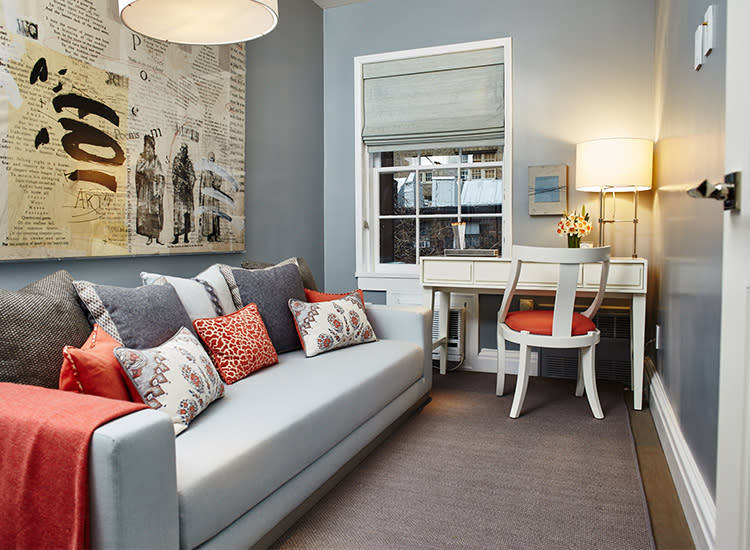
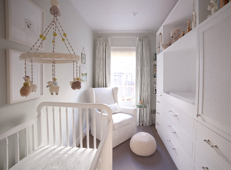
Converting a small space into a nursery is hardly a unique challenge. But when you’re dealing with New York City apartments, that challenge can feel like mission impossible—even when you work in interior design. Meet Elizabeth Brown, CEO of an interior design marketplace called Viyet. With the help of Margaret Ash Design, she transformed her narrow home office into a bright, classic nursery for her baby boy, Theo. Here, she shares her tips about what to prioritize in a small space.
Before:
After:
What are the dimensions of the space?
The room is 7’2’’ x 11’ 9.5’’.
Storage is often overlooked in the nursery. Tell us about your unique approach.
Our wall unit was custom built, but we actually lifted the design from a storage piece our designer, Maggie, had retro-fitted for her own nursery. Our timing could not have been luckier; she was also pregnant with her first child when we started working together, so she knew just how much baby gear was about to come our way. She added in a few thoughtful details from her own experience, such as designated cabinets and drawers to keep eyesores like diaper pails and pumping equipment out of view.
In terms of furniture, how did you prioritize? Are there any items you wished you could’ve purchased, but space just didn’t allow?
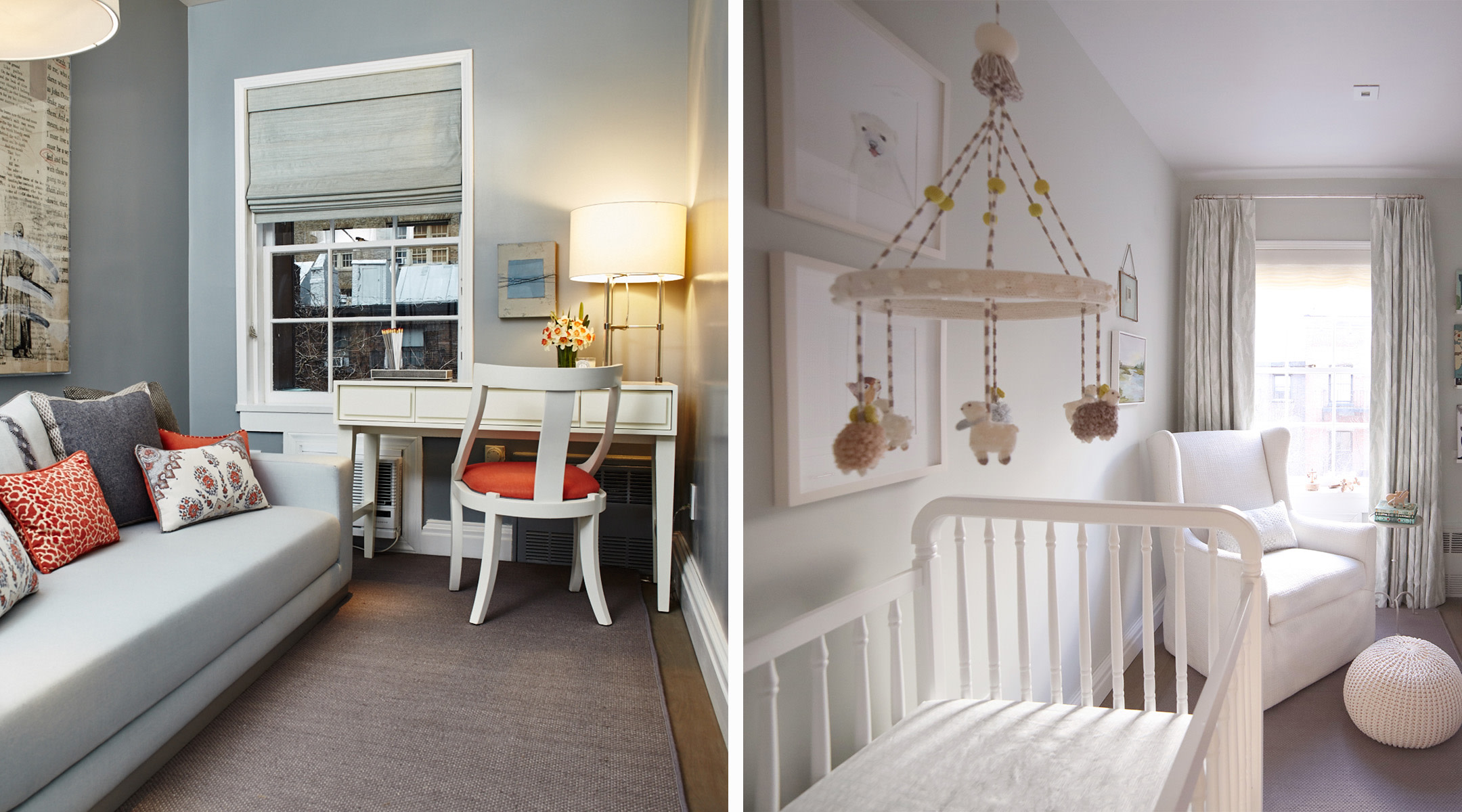
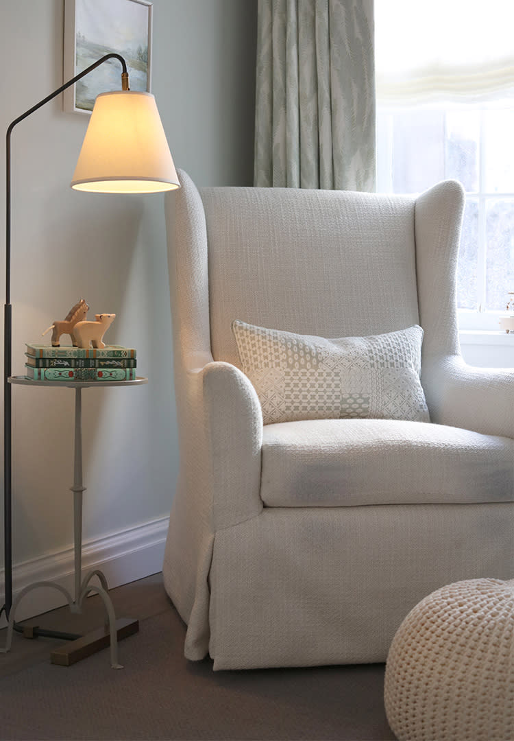
For us, a comfortable chair for the inevitable middle-of-the-night feedings was critical. We wanted something high quality that wouldn’t get too worn out from use. I would have loved to have the space a full-size ottoman, but the cute little pouf gets the job done.
What was the first item you bought?
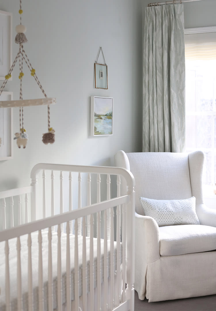
The first item we bought was the crib, which is from Serena & Lily. Since that was the most critical item, we wanted to get it into the space first to make sure we had room for everything else.
The soft, light tones really open up the room. Can you tell us a little about the color scheme?
The room had previously been a dark gray back when it was a home office, so we knew we wanted something lighter and brighter. We started with the curtain fabric, Nori by Clay McLaurin Studio in Sea Blue, which we found at Studio Four here in NYC, and went from there. I loved the pale green and aqua tones, which still felt right for a little boy, but a little less expected than blue. The walls are painted Pale Powder by Farrow and Ball, which is a soft grayish celadon.
The small wooden accessories, like the carousel and horses, are adorable. Where did they come from?
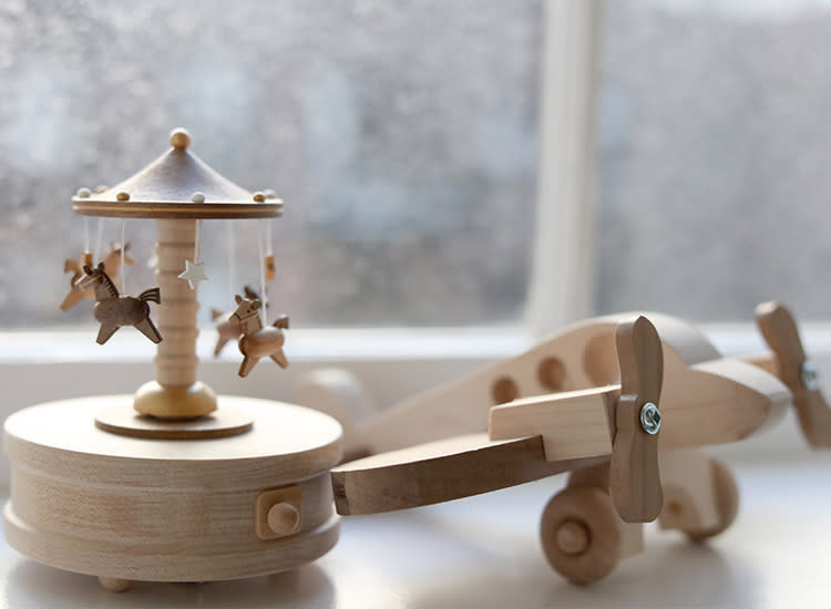
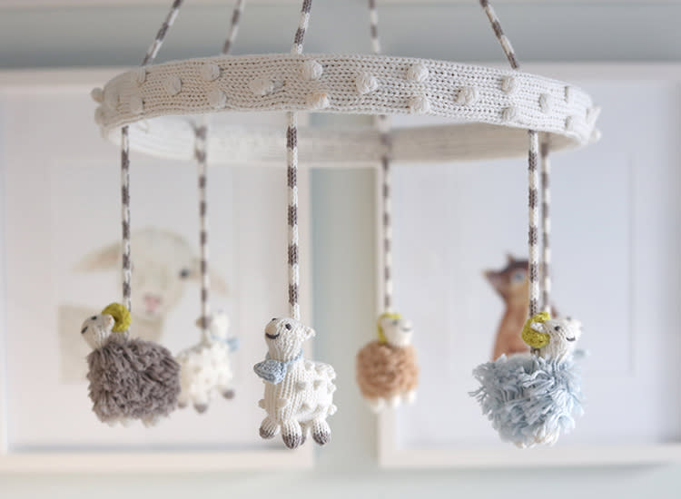
The carousel was a gift from my brother and his husband. We picked up the wooden animals in Copenhagen last summer when I was about 5 months pregnant. The mobile is from Bla Bla Kids.
Does one accessory or piece of art embody the entire nursery style?
My favorite piece of art is the small painting above the chair, which my mother painted of the marsh view from behind our beach house where I grew up in South Carolina. I love that it extends the blues and the greens from the curtains, with the added benefit of bringing a special sentimental touch.
In your mind, which nursery items are most worth splurging on?
With such a small room, we decided to splurge on custom window treatments that would cozy up the space and give the impression of higher ceilings. Our designer’s suggestion to add a black-out lining to the reverse of the curtains also ended up being a brilliant idea, especially when it comes to daytime naps.
Published April 2018
Navigate forward to interact with the calendar and select a date. Press the question mark key to get the keyboard shortcuts for changing dates.


