Tour an Airy, Whimsical Nursery in a San Francisco Victorian
When Homepolish designer Annouchka Engel relocated across the country with her husband, David, in October 2014, they bought a 140-year-old Victorian townhouse in San Francisco with narrow hallways and small rooms that was beautiful, but in serious need of a renovation. Annouchka was determined to create an open feel that would maintain the original character of the home, accented with quirks, personality and more efficiently used spaces. When she got pregnant a few months later, she applied the same vision to daughter Chloé’s nursery. We spoke with the designer to get the scoop on how she decorated the room with a relaxing vibe and meaningful accessories.
Describe your vision for the nursery.
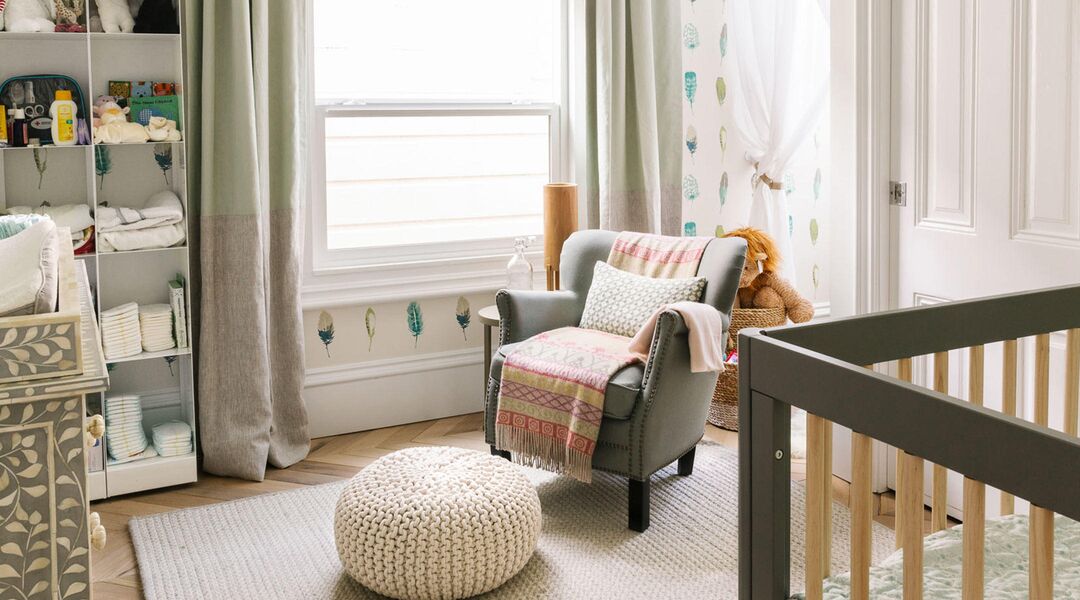
I wanted a very calming color palette—I usually stick to three colors—and a room where baby and I wouldn’t feel overwhelmed. I loved the soothing seafoam-green paint color in our TV room and I decided to use it in the nursery too, along with gray and white. My mother decorated my nursery in a unisex color so I also wanted to design a room for my child that wasn’t gender defining (even though I knew I was having a girl, love pink and have used it in many rooms throughout our house).
Did designing Chloé’s nursery differ from working with clients?
The approach and process to decorating my own house was very much like the one I use for professional projects. I started brainstorming and researching with a mood board and layout dimensions in July 2015, when I was around five months pregnant. I ordered everything in September and finished the room at the end of October, about three weeks before Chloé was born.
Tell us about the furniture in the room.
The CB2 bookcases have been with us since our apartment in New York City. They’re so flexible and neutral that they fit in any space. It’s also great to have a dedicated and accessible spot for diapers. The first piece I bought specifically for the nursery was the leaf-patterned Restoration Hardware dresser and changing table. I wanted it (along with the wallpaper) to be the first thing you see when entering the room. Next, I looked for a chair that wasn’t a rocking chair—the nursery is only about 12 feet by 9 feet, and those tend to take up more room.
Those paintings really stand out! Where did you find them?
I was at my hairdresser and the salon hosts a monthly rotating art exhibit. I was really taken by these two from Wendy Vasta—the color, shapes and size were a good match for the room.
Are any items hand-me-downs or repurposed from other rooms?
Beside the bookcases, the rocking horse was mine when I was growing up. My dad flew with it from Montreal to give it to Chloé.
The wallpaper is so pretty! What made you decide to do an accent wall?
The wallpaper is on the back wall and in the little nook where the rocking horse and canopy tent are. It helps give the room a calm, airy feel and look put-together without being too precious.
The mobile is really eye catching too. How did you find one that matched so well?
It’s custom made by my stepmother, who is a designer and artist in Montreal. Our whole family loves horses and I’ve been riding since I was little girl, so it was a fitting gift. She hand-sewed each horse with a different pattern—it’s a true labor of love.
Homepolish is an interior design startup bringing full-service, accessible design to clients across the country (with more than 500 designers nationwide). Since launching in the fall of 2012, Homepolish has quickly become the go-to brand for emerging interior design talent and design inspiration of a savvier clientele looking to furnish their homes and offices. See the beautiful spaces they’ve transformed—on every budget—right here.
Navigate forward to interact with the calendar and select a date. Press the question mark key to get the keyboard shortcuts for changing dates.


